74 design systems · curated UI blocks
Brand DESIGN.md Files & Production-Ready UI Blocks
Every system below is documented as a single DESIGN.md — colours, type scale, geometry, and component rules an AI editor can read. Open one, copy it, drop it in your repo root.
design system library
74 documented brandsEvery brand system, written as one DESIGN.md
Search the library, open a brand, and copy the full specification. Each system has its own page at /brand/design-md.
Airbnb
Airbnb
A warm, generous consumer marketplace anchored on a clean white canvas and Airbnb Rausch (#ff385c), the single brand voltage that carries every primary CTA, search-button orb, and rating dot. Type runs Airbnb Cereal VF at modest weights — display sits at 22–28px in weight 500/600 rather than the heavy 700+ that fintech and enterprise systems use; the brand trusts photography and generous…
Airtable
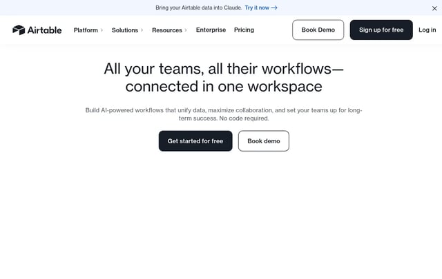
A sober, editorial workflow-software interface anchored on white canvas and dark-ink type, where brand voltage comes from full-bleed signature cards in coral, dark green, peach, and dark navy that punctuate long-scroll explainer pages. Primary actions use a near-black pill CTA; secondary actions sit in a white outlined button. Type runs Haas Grotesk in modest weights — never bold for its own sake.
Apple
Apple
A photography-first interface that turns marketing into a museum gallery. Edge-to-edge product tiles alternate light and dark canvases, framed by SF Pro Display headlines with negative letter-spacing and a single Action Blue (#0066cc) interactive color. UI chrome recedes so the product can speak — no decorative gradients, no shadows on chrome, only the one signature drop-shadow under product…
Binance
Binance
A confident financial-platform interface anchored on a deep near-black canvas, where Binance's iconic yellow (#FCD535) carries every primary CTA, brand accent, and value-claim moment. Type runs Binance's custom BinanceNova / BinancePlex stack at modest weights — the system trusts size and yellow voltage over bold weight. Marketing and product surfaces default to the dark theme; transactional…
BMW
BMW
BMW's corporate site — distinct from BMW M's motorsport-bombastic variant, this is a measured and settled corporate-automotive interface. On a light (cream-tinted white) canvas, BMW corporate blue (#1c69d4) carries every primary CTA; dark navy hero bands frame model photography. BMW Type Next Latin sets the entire hierarchy on two weights — heavy 700 display and Light 300 body. Configuration and…
BMW-M
BMW-M
A motorsport-engineering interface anchored on a near-black canvas with white BMW Type Next Latin display headlines in confident UPPERCASE. The brand carries no decorative voltage — its energy comes from full-bleed automotive photography (cars on tracks, driver-cockpit shots, carbon-fiber detail) and the iconic M tricolor stripe (light blue → dark blue → red) used sparingly as a brand signature…
Bugatti
Bugatti
An austere luxury-automotive interface that uses near-pure black canvas, white uppercase letterspaced display, and full-bleed automotive photography as the only voltage. The system runs three custom Bugatti typefaces — Bugatti Display, Bugatti Text Regular, and Bugatti Monospace — and combines them at modest weights with wide tracking to feel European-engineered, hyper-minimal, and quietly…

Cal.com
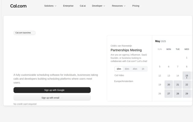
A clean, calendar-software-first interface anchored on white canvas with black primary CTAs and custom Cal Sans display typography. The system reads as friendly modern SaaS — generous whitespace, soft-rounded cards (~12px), product UI fragments shown directly inside cards, and a dark navy footer that visually closes long-scroll pages. Brand voltage comes from the Cal Sans display headline (a…
Claude
Claude
A warm-canvas editorial interface for Anthropic's Claude product. The system anchors on a tinted cream canvas with serif display headlines, warm coral CTAs, and dark navy product surfaces (code editor mockups, model showcase cards). Brand voltage comes from the cream/coral pairing — deliberately warm and humanist where most AI brands use cool blue + slate. Type voice runs a slab-serif display…
Clay
Clay
A vibrant claymation-meets-data interface for Clay.com (GTM data-orchestration platform). Anchors on white canvas with dark-navy primary CTAs, custom rounded display type, and saturated single-color feature cards — hot pink, deep teal, lavender, peach, ochre — that punctuate long-scroll explainer pages. Brand voltage comes from 3D-rendered claymation illustrations (mountains, characters, mascots)…
ClickHouse
ClickHouse
A high-performance database interface anchored on near-pure black canvas with electric yellow as the brand voltage. White typography in confident sans, yellow CTAs, and yellow-text stat numbers carry the brand voice across every page. Code blocks and product UI fragments embed directly in dark cards. The yellow + black pairing (and yellow used scarcely as accent) is the system's signature — brand…
Cohere
Cohere
Cohere's 2026 web system is a controlled enterprise AI interface built from stark white editorial space, deep green-black product bands, soft mineral surfaces, rounded media cards, and a distinctive type split between monospaced-feeling display headlines and precise Unica77 UI text.
Coinbase
Coinbase
An institutional-grade crypto exchange whose marketing surfaces read like a quietly-confident financial-services brand. The base canvas is pure white; Coinbase Blue (`#0052ff`) is the single brand voltage, used scarcely on primary CTAs, signature glyphs, and inline accent moments. Type runs Coinbase's licensed CoinbaseDisplay (display) and CoinbaseSans (body) at modest weights — display sits at…
Composio
Composio
A developer-tools brand for AI-agent tool integration whose marketing surfaces lean into a dark, technical aesthetic with a single deep-electric-blue voltage (`#0007cd`). The page floor is near-black (`#0f0f0f`); cards float above on subtle gray-tinted surfaces. abcDiatype carries display and body in a single sans family with weights 400-600. The brand's strongest visual signature is a four-pane…

Cursor
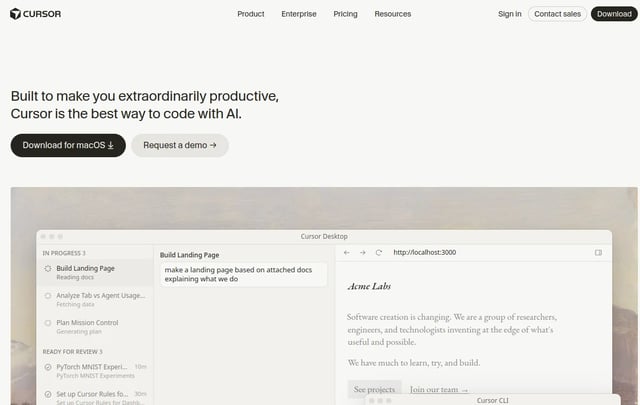
An AI-first code editor whose marketing site reads like a quietly-confident developer-tools brand with a warm-cream editorial canvas (`#f7f7f4`) instead of the typical dark IDE atmosphere. Near-black warm ink (`#26251e`) carries body and display alike — display sits at weight 400 with negative letter-spacing for a magazine feel rather than a bold tech voice. The single brand voltage is **Cursor…
Dell 1996
Dell 1996
An inspired interpretation of Dell.com's 1996 design language — a catalog-era enterprise web design built around a literal black page frame, vivid flat color-block "ribbon cards" tinted in sage, salmon, periwinkle, sky, peach and lime, chunky Helvetica-Black display titles, Times Roman body copy, and an entire visual vocabulary of pre-Photoshop hand-cut GIF stickers (NEW! bursts, award seals,…

ElevenLabs
A voice-AI brand whose marketing surfaces read like a quietly editorial print magazine. The base canvas is off-white (`#f5f5f5`) holding warm near-black ink (`#292524`); the brand voltage is photographic, not chromatic — soft pastel atmospheric gradient orbs (mint → peach → lavender → sky) drift through the page as the only "color" moments. Display runs Waldenburg Light at weight 300 — the…
Expo
Expo
A React Native developer-platform whose marketing site reads like a quietly-confident infrastructure brand. The base canvas is pure white with a soft sky-blue gradient atmospheric wash behind the hero; near-black ink (`#171717`) carries body and display alike. The single brand voltage is **pure black** (`#000000`) for primary CTAs — minimal and editorial-feeling, paired with a small blue…
Ferrari
Ferrari
A luxury-automotive brand whose marketing surfaces read as cinematic editorial. The base canvas is **near-black** (`#181818`) holding pure white display type; white-canvas bands appear only inside specific editorial contexts (preowned listings, pricing tables). The single brand voltage is **Rosso Corsa** (`#da291c`) — the iconic Ferrari racing red — used scarcely on primary CTAs, the Cavallino…
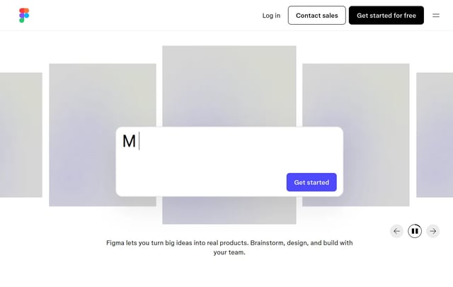
Figma
"A confident black-and-white editorial frame interrupted by oversized, hand-cut pastel color blocks. The marketing canvas is rigorously monochrome — figmaSans variable type, pure white surfaces, pure black ink, pill-shaped CTAs — while each story section drops the page into a saturated lime, lavender, cream, mint, or pink panel that reads like a sticky note placed on a clean desk. The result is a…
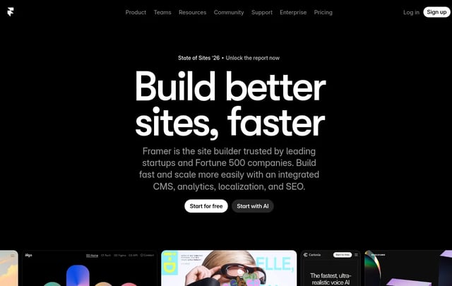
Framer
"A confident dark-canvas builder marketing site that treats the page like a working artboard — pure black surfaces, white display type set in GT Walsheim Medium with aggressive negative tracking, and a single confident blue (#0099ff) reserved for hyperlinks and selection states. The page rhythm is broken by oversized vibrant gradient atmosphere panels — magenta, violet, orange spotlights — that…
HashiCorp
HashiCorp
"An enterprise-infrastructure marketing canvas built around a near-black ground (#000000) and a system of per-product accent colors — Terraform purple, Vault yellow, Consul pink, Waypoint cyan, Vagrant blue — that act as identity tokens rather than decorative palette. Display type is hashicorpSans set in 600/700 with tight 1.17–1.21 line-heights; body type runs the same family at 500 weight with…
HP
HP
An inspired interpretation of HP's design language — a white-paper enterprise-consumer system anchored by HP Electric Blue (`#024ad8`) as the lone signal CTA, near-black ink (`#1a1a1a`) for headlines, geometric Forma-DJR sans throughout, and angular blue-chevron decorations that nod to the HP wordmark's slashes. Cards round at 8–16px, photos sit in soft 16px frames, and dark navy slabs anchor the…
IBM
IBM
"An enterprise-marketing canvas faithful to Carbon Design System: white surfaces, charcoal type, IBM Blue (#0f62fe) as the single confident accent, and a deliberately flat-square aesthetic where corners stay at 0–4px. Type runs IBM Plex Sans at light weight 300 for display sizes (a brand signature) and 400/600 for body and emphasis. Cards live as thin-bordered tiles with no shadow; sections…
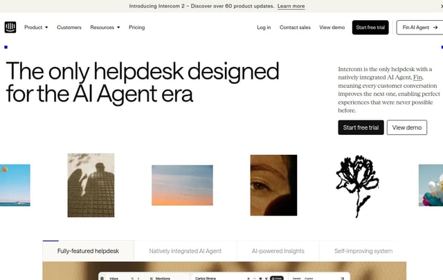
Intercom
"An editorial customer-service marketing canvas built around a soft cream-white ground, charcoal type set in Saans (Intercom's proprietary geometric sans), and a single confident Fin Orange (#ff5600) reserved for the Fin AI brand. Cards live as floating white tiles with thin hairline borders and minimal radii (8–16px). Display headlines run Saans at weight 500 with measured negative tracking. The…
Kraken
Kraken
Kraken's website is a clean, trustworthy crypto exchange that uses purple as its commanding brand color. The design operates on white backgrounds with Kraken Purple (`#7132f5`, `#5741d8`, `#5b1ecf`) creating a distinctive, professional crypto identity. The proprietary Kraken-Brand font handles display headings with bold (700) weight and negative tracking, while Kraken-Product (with IBM Plex Sans…
Lamborghini
Lamborghini
Lamborghini's website is a cathedral of darkness — a digital stage where jet-black surfaces stretch infinitely and every element emerges from the void like a machine under a spotlight. The page is almost entirely black. Not dark gray, not near-black — true, uncompromising black (`#000000`) that saturates the viewport and refuses to yield. Into this abyss, white type and Lamborghini Gold…
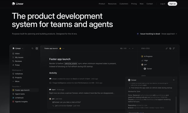
Linear
"A near-black product-focused marketing canvas built around #010102 (the deepest dark surface of any tool in this collection), light gray text (#f7f8f8), and the signature Linear lavender-blue (#5e6ad2) used as the single chromatic accent. The system reads as software-craft documentation: dense, technical, and quietly luxurious. Display type is set in the Linear custom sans (SF Pro Display…

Lovable
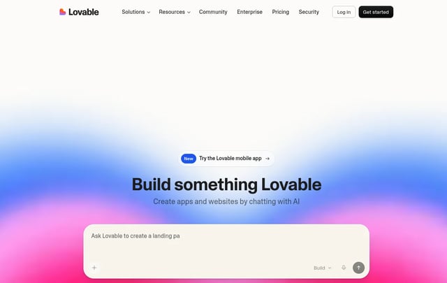
Lovable's website radiates warmth through restraint. The entire page sits on a creamy, parchment-toned background (`#f7f4ed`) that immediately separates it from the cold-white conventions of most developer tool sites. This isn't minimalism for minimalism's sake — it's a deliberate choice to feel approachable, almost analog, like a well-crafted notebook. The near-black text (`#1c1c1c`) against…
Mastercard
Mastercard
Mastercard's experience reads like a warm, editorial magazine built from soft stone and signal orange. The canvas is a muted putty-cream (`#F3F0EE`) — not white, not gray, but a color that feels like the paper of a premium annual report. On top of that canvas, everything that matters is shaped like a stadium, a pill, or a perfect circle. The dominant visual gesture is the **oversized radius**:…
Meta
Meta
Meta's design system spans hardware commerce (Quest VR, Ray-Ban Meta AI glasses) and brand surfaces with a confident product-merchandising voice. The system pairs a stark white canvas with full-bleed photographic product cards, a confident Optimistic VF wordmark/headline face, dual-CTA hero patterns (black primary + outlined secondary), and a saturated cobalt blue (#0064E0) for in-product…
MiniMax
MiniMax
MiniMax presents itself as a premium AI infrastructure brand through a striking duality — bold black-pill CTAs and stark white canvas for marketing, paired with vibrant gradient product cards (orange-red, magenta-pink, purple, blue) that turn each model release into a distinctive visual identity. The system uses DM Sans across all surfaces, employs an oversized 80px hero display, anchors major…
Mintlify
Mintlify
Mintlify presents documentation infrastructure with a dual-mode aesthetic — atmospheric sky-gradient marketing heroes (cloud illustration backdrops, soft cream-to-blue washes) paired with dense developer-grade documentation surfaces. The system uses Inter for UI prose, Geist Mono for code, and a signature Mintlify green ({colors.brand-green}) reserved for accent CTAs and active states. Black-pill…
Miro
Miro
Miro presents itself as the AI-powered visual workspace through a confident, almost playful brand voice — anchored by its signature canary yellow ({colors.brand-yellow}) wordmark over white canvas, broken open by colorful pastel feature tints (rose, teal, coral, orange, mint) that echo the actual sticky-note color palette used on the live whiteboard. Black-pill primary buttons dominate marketing,…

Mistral-AI
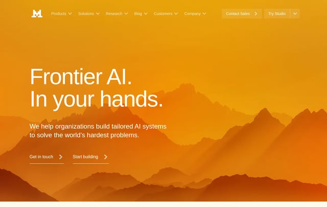
Mistral AI brands itself with a singular signature — atmospheric sunset gradients (mustard, orange, deep red) layered over photography of mountains, plus a horizontal "sunset stripe" bar that closes every page. The system pairs warm cream-yellow surfaces ({colors.cream}) with a saturated orange primary CTA ({colors.primary}) and uses an elegant near-serif voice for hero displays. Coverage spans…
MongoDB
MongoDB
MongoDB carries a strong dual-mode visual identity — dark deep-teal hero bands with bright MongoDB green ({colors.brand-green}) CTAs paired with stark white documentation surfaces. The signature green pill button is unmistakable across product, pricing, learning, and AI use-case surfaces. The system uses Euclid Circular A as its display face, anchors a 3-tier pricing comparison (Free / Flex /…
Nike
Nike
|
Nintendo.com (2001)
Nintendo.com (2001)
An analysis of Nintendo.com's 2001 design language — a brushed-periwinkle "console chrome" interface where every panel is a beveled metal plate, navigation glows amber over a halftone-dotted carbon bar, and bold outlined display type sits on circuit-board hero fields. A Y2K hardware aesthetic that treats the web page like the faceplate of a game system.
Notion
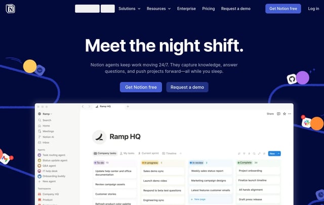
Notion presents itself as the all-in-one workspace through a confident, illustration-rich brand voice — anchored by a deep navy hero band ({colors.brand-navy}) decorated with brand-colored sticky-note dots and mesh wire illustrations, a signature purple pill primary CTA ({colors.primary}), and a rich palette of pastel-tinted feature cards that echo the colorful database properties of the live…
NVIDIA
NVIDIA
|
Ollama
Ollama
|
OpenCode
OpenCode
|
|
PlayStation
PlayStation
|

PostHog
|
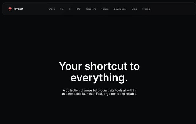

Raycast
|
Renault
Renault
|
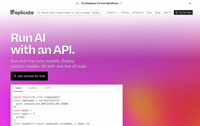

Replicate
|
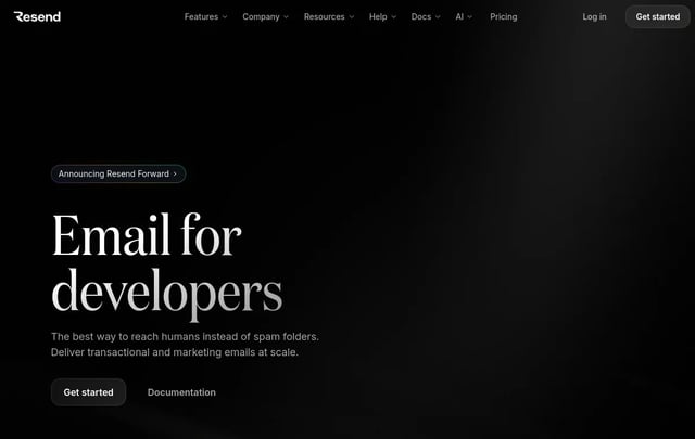

Resend
|
Revolut
Revolut
|
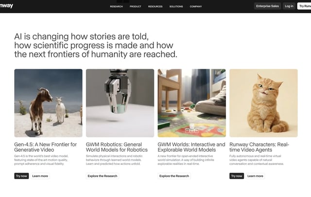

Runway
Runway's interface is a cinematic reel brought to life as a website — a dark, editorial, film-production-grade design where full-bleed photography and video ARE the primary UI elements. This is not a typical tech product page; it's a visual manifesto for AI-powered creativity. Every section feels like a frame from a film: dramatic lighting, sweeping landscapes, and intimate human moments captured…
Sanity
Sanity
Sanity's website is a developer-content platform rendered as a nocturnal command center -- dark, precise, and deeply structured. The entire experience sits on a near-black canvas (`#0b0b0b`) that reads less like a "dark mode toggle" and more like the natural state of a tool built for people who live in terminals. Where most CMS marketing pages reach for friendly pastels and soft illustration,…
Sentry
Sentry
An inspired interpretation of Sentri's design language — a developer-tools brand built on a deep purple-violet midnight canvas, electric lime accents, and a slightly subversive illustrated personality. The system pairs a custom display sans (chunky, playful, near-condensed) with the open Rubik family for UI copy and Monaco for code, then leans on dark-on-light pricing surfaces, sticker-style…
Shopify
Shopify
An inspired interpretation of Shopifi's design language — a cinematic commerce platform that runs two parallel design tracks. The marketing-hero and product-narrative pages live on near-black canvases with full-bleed photography of merchants, giant Neue Haas Grotesk display type at thin weights, and a single black-pill CTA stroked in white. The transactional pages (pricing, signup, dashboards)…
Slack
Slack
An inspired interpretation of Slacc's design language — a workplace messaging brand built on a deep aubergine primary, with cream-lavender hero gradients, blue inline links, and pill CTAs. The system pairs a proprietary humanist sans for display with a separate utility sans for body, and stages product UI mockups inside soft pastel-mesh hero composites that act as both decoration and feature…
SpaceX
SpaceX
An inspired interpretation of Spasex's design language — a mission-oriented aerospace brand built on pure black canvas, full-bleed photographic and video heroes of rockets and Mars landscapes, and uppercase D-DIN display type set in tight vertical leading. UI chrome is intentionally minimal a single ghost outlined pill button per band, all-caps eyebrow microtext, and a fixed top nav over…
Spotify
Spotify
Spotify's web interface is a dark, immersive music player that wraps listeners in a near-black cocoon (`#121212`, `#181818`, `#1f1f1f`) where album art and content become the primary source of color. The design philosophy is "content-first darkness" — the UI recedes into shadow so that music, podcasts, and playlists can glow. Every surface is a shade of charcoal, creating a theater-like…
Starbucks
Starbucks
Starbucks' design system is a **warm, confident retail flagship** wearing the green of their storefront apron across every surface. The canvas alternates between a neutral-warm cream (`#f2f0eb`) and a ceramic off-white (`#edebe9`) — colors that reference actual store materials: the paper napkins, the café walls, the wood finishes — while the signature **Starbucks Green** (`#006241`) anchors the…
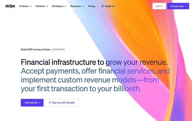
Stripi
An inspired interpretation of Stripi's design language — a financial-infrastructure brand built on a deep navy ink, an electric indigo primary, and a recurring atmospheric gradient mesh that occupies the upper third of nearly every marketing page. The system pairs the proprietary Sohne family at thin (300) weights with negative letter-spacing for editorial-density display headlines, and uses…
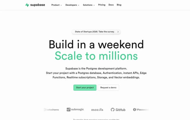
Supabaze
An inspired interpretation of Supabaze's design language — an open-source database platform built on a clean white-and-near-black system with a single signature emerald-green CTA, a custom humanist sans display tier, and dense product UI mockups composited above the hero. The brand reads as quietly technical: minimal chrome, a near-monochrome palette, and the green primary acting as the only…
Superhuman
Superhuman
An inspired interpretation of Superhumon's design language — a fast-email productivity brand split between an editorial dark hero (deep indigo navy with violet-sky atmospheric backdrop and a portrait subject) and a quiet white content body with off-warm-grey ink. The system uses a single proprietary variable display sans, heavy weight 460–540 with tight tracking, and a deep-teal closing CTA band…
Tesla
Tesla
Tesla's website is an exercise in radical subtraction — a digital showroom where the product is everything and the interface is almost nothing. The page opens with a full-viewport hero that fills the entire screen with cinematic car photography: three vehicles arranged on polished concrete against a hazy cityscape sky, with a single model name floating above in translucent white type. There are…
The Verge
The Verge
The Verge's 2024 redesign feels like somebody wired a Condé Nast magazine to a chiptune soundboard. The canvas is almost-black (`#131313`), the headlines are built from a brutally heavy display face (Manuka) that runs up to 107px, and the whole page is peppered with acid-mint `#3cffd0` and ultraviolet `#5200ff` that behave less like brand colors and more like hazard tape. Story tiles are not…
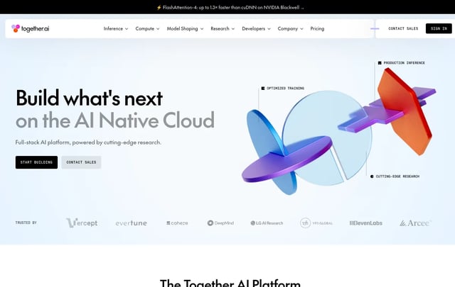

Together-AI
An inspired interpretation of Together AI's design language — an AI infrastructure platform whose surface alternates between near-black hero bands (with a three-color orange-magenta-periwinkle gradient as the single piece of brand chrome) and bright white research / pricing / docs bands, knit together by a custom display sans and an uppercase mono eyebrow face.
Uber
Uber
An inspired interpretation of Uber's design language — a transportation-and-delivery super-app brand whose web surface is a black-and-white duet, framed by a custom geometric display sans, accented by a single signature pill shape (radius 999px) on every interactive element, and decorated only by editorial 4:3 illustrations of riders, drivers, and city objects.
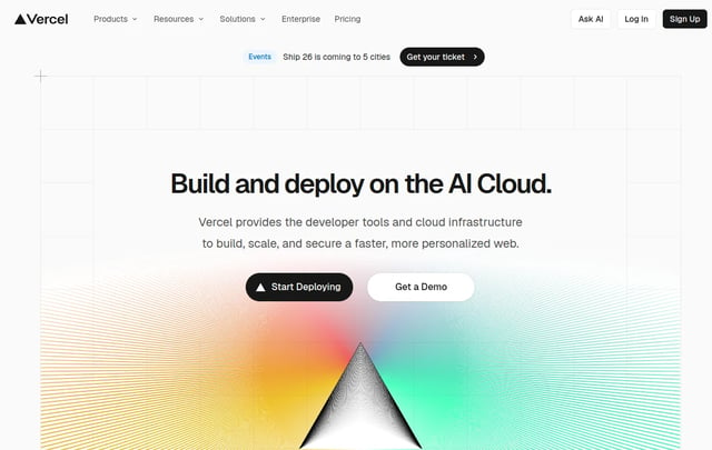
Vercel
An inspired interpretation of Vercel's design language — a developer-platform brand whose surface is a stark black-and-ink duet on near-white canvas, broken at hero scale by a multi-color mesh gradient (cyan / blue / magenta / amber) that acts as the entire decorative system, paired with a custom geometric sans for headlines and a monospaced caption face for technical labels.
Vodafone
Vodafone
An inspired interpretation of Vodafone's design language — a telecom super-brand whose web surface alternates between editorial photography hero bands with massive uppercase display headlines and clean white content bands, anchored by the company's signature scarlet red CTA and the proprietary Vodafone display sans set at impossibly heavy 800 weight.
Voltagent
Voltagent
An inspired interpretation of Voltagent's design language — a developer-focused AI agent engineering platform whose surface is an unrelenting near-black canvas broken only by a single electric-green brand accent, code-editor mockups inside the hero, and a precise grid of dark feature cards that read like a documentation site dressed as marketing.
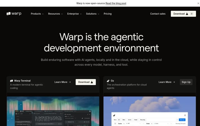

Warp
An inspired interpretation of Warp's design language — an agentic terminal-and-development-environment brand whose surface is a warm near-charcoal canvas (a tint warmer than pure black), broken only by clean Inter typography, the occasional Instrument Serif italic moment, and dense terminal-mockup imagery; CTAs are unusually understated, with shape geometry running tighter than most marketing…
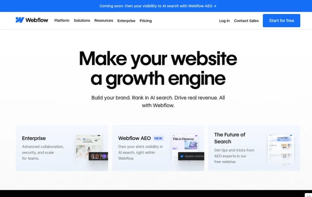
Webflow
An inspired interpretation of Webflow's design language — a visual web development platform whose surface contrasts a deep near-black `#080808` primary against a generous white canvas, broken by a five-stop chromatic accent system (purple / pink / blue / orange / green) that maps to the brand's product categories, and anchored by the proprietary WF Visual Sans family used at restrained 500 / 600…
Wired
Wired
An inspired interpretation of Wired's design language — a flagship technology-magazine brand whose surface is a strict editorial duet of stark black wordmark on white canvas, anchored by a tall narrow custom display serif for hero headlines, a humanist serif body face for long-form reading, and a clean sans face for metadata; layout reads like a printed magazine ported to the web with very little…
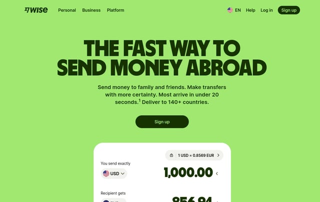

Wise
An inspired interpretation of Wise's design language — a global money-transfer brand whose surface combines an unusually heavy near-black display sans (weight 900 at 64–126 px) with a vivid lime-green brand accent, sage-tinted surface neutrals, and rounded white cards on a pale green-tinted canvas; the whole system reads more like a Scandinavian fintech magazine than a bank.
xAI
xAI
An inspired interpretation of xAI's design language — Elon Musk's frontier-AI company whose web surface is a strict near-black canvas broken only by white pill outlines, occasional warm sunset / dusk gradient accents, a custom geometric sans (Universal Sans) for display, and an uppercase tracked monospace caption face; the whole system reads as engineered-cosmic, unmarketed.
Zapier
Zapier
An inspired interpretation of Zapier's design language — a workflow-automation platform whose surface combines warm-cream neutrals (`#fffefb` canvas, `#f8f4f0` soft cream) with deep coffee ink (`#201515`) and a single saturated orange CTA accent (`#ff4f00`); typography pairs the proprietary Degular Display family at hero scale with Inter for sub-displays and body, giving the brand a…
simple explanation
5th grade clarityWhat is a UI Library? (5th Grade Explanation)
Imagine you are building a castle out of Lego blocks. Instead of making every wall and tower from scratch, a UI Library gives you pre-made wall sections that snap together instantly.
1. Pre-Built Web Sections
Instead of spending hours writing CSS, you pick pre-built page sections like top headers, feature grids, and pricing tables.
2. One-Click Copy & Paste
Click the "Copy Code" button and paste the component directly into your React codebase or AI coding editor.
3. Looks & Works Great
Every section looks stunning in dark mode, works smoothly on mobile phones, and is easy for screen readers to read.
interactive explorer
ui library showcaseExplore UI Section Blocks
Filter by section type, preview rendered UI blocks, or copy production React TSX code.
SaaS Hero with Dark Glow & Badges
Modern hero section featuring Satoshi typography, glassmorphism badges, and action CTA group.
Build Accessible Web Interfaces Faster
Pixel-perfect components engineered with Satoshi typography and OKLCH color palettes.
key advantages
why our ui libraryBuilt to Modern Enterprise Standards
Designed for speed, accessibility, and frictionless integration with AI tools.
WCAG 2.1 AA Verified
Every color combination meets strict 4.5:1 contrast standards for body text and headers.
100% Responsive
Tested across mobile, tablet, desktop, and ultra-wide monitor viewports.
Dark Mode Native
Sleek dark modes with glassmorphic blurs, subtle borders, and glow effects built-in.
Zero Runtime CSS
Utilizes pure Tailwind CSS v4 utility classes for maximum performance and minimum bundle size.
faq
ui library questionsUI Library FAQ
Common questions about using our section blocks and components.
Do I need to install any external npm packages?
No! All UI blocks use standard React 19 JSX and Tailwind CSS utility classes. Simply copy the code and paste it directly into your project.
Can I customize the colors and fonts?
Absolutely. All components reference design system CSS custom properties (--color-primary, --font-sans) so changing your global theme automatically updates all UI blocks.
Start Building with Ready-to-Use UI Blocks
Copy UI section blocks or explore our atomic component library for primitive building blocks.